This news post isn't available in your region.
ROTOCON’s next chapter
ROTOCON has unveiled a refreshed brand identity, including a new logo, signalling a significant moment in the company’s evolution.
ROTOCON has unveiled a refreshed brand identity, including a new logo, signalling a significant moment in the company’s evolution.
THE REBRAND is a visual and strategic shift that reflects ROTOCON’s role in the global label and narrow web printing industry, according to the company.
The new logo positions ROTOCON as a modern, fully-fledged brand defined by innovation, reliability, the relationships it builds and the solutions it delivers,’ ROTOCON says. ‘It marks a new chapter, shaped by growth, international expansion and a sharpened focus on delivering integrated printing and finishing systems for customers around the world.’
Precision meets simplicity
ROTOCON explains the design choices behind its new brand identity. The refreshed wordmark introduces a clear, distinctive and modern visual style. The cleanly executed ‘R’ anchors the brand, while the ‘N’ provides a deliberate, technically precise conclusion. Between these anchors, the symmetrical design of the ‘Os’ reflects ROTOCON’s pursuit of uniformity, balance and performance.
At the centre of the logo is ROTOCON’s distinctive red mark: clean and recalibrated for a digital world. It represents continuity, precision and innovation – a visual thread carried from ROTOCON’s roots into its future. ‘Every curve and proportion has been carefully thought out, not merely for aesthetics, but to mirror the engineering accuracy that defines the machinery bearing the ROTOCON name,’ explains the company.
Evolving this logo was not a quick design exercise, ROTOCON explains. It was a considered response to years of transformation. ‘What began as a technical distributor representing leading international brands in South Africa has grown into a global partner, with turnkey production solutions and an expanding catalogue of in-house engineered technology. The new identity captures this shift: refined focus, elevated capability and an international presence supported by German-engineered excellence.’
Performance with personality
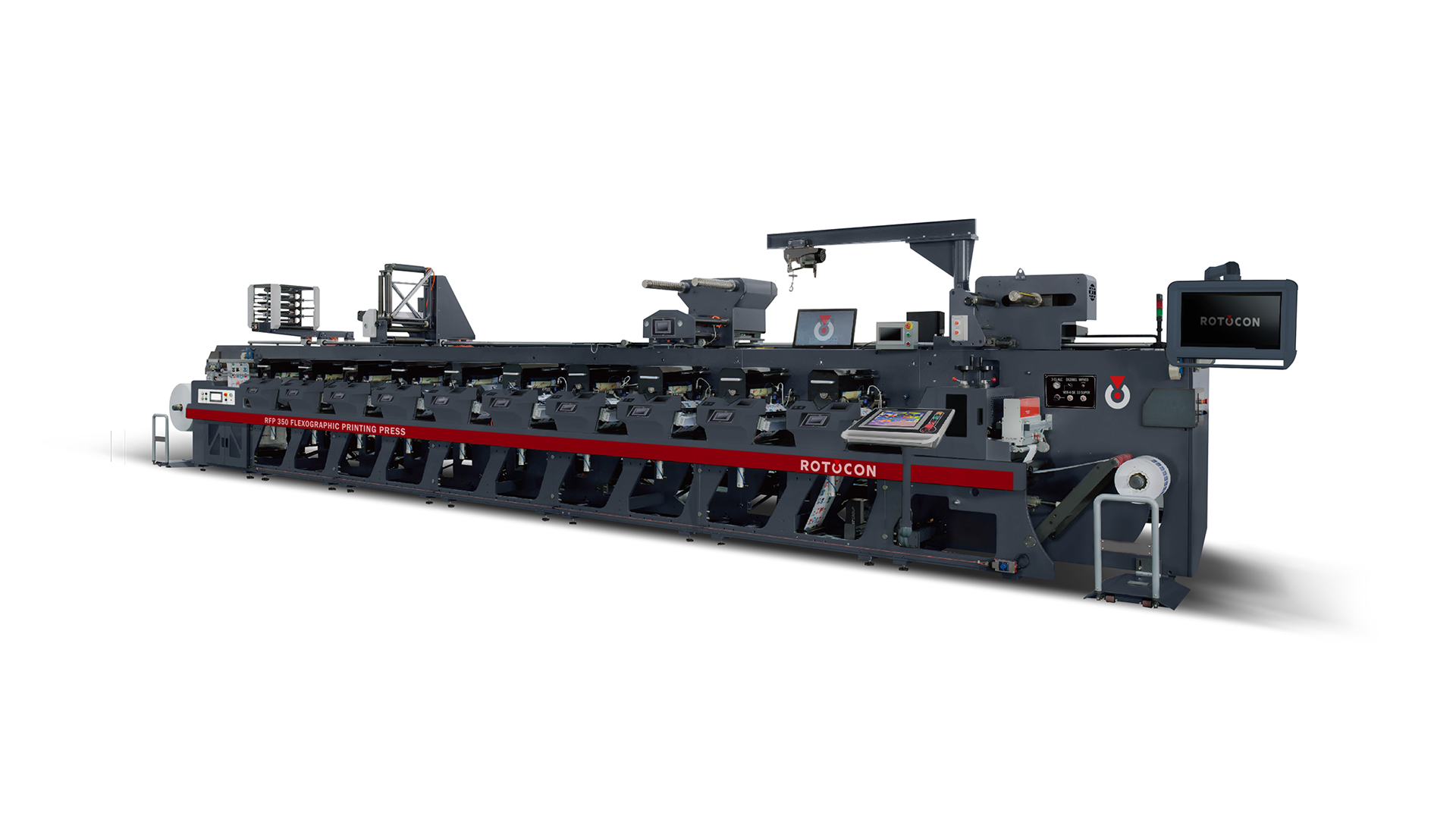
Central to ROTOCON’s global identity is its engineering division in Germany – a team dedicated to building machines that combine precision with individuality. ‘Every press and finishing system carries the unmistakable mark of thoughtful engineering, durability and craftsmanship,’ ROTOCON says. ‘Each machine is both a workhorse and a calling card, reflecting the company’s promise of performance, consistency and care.’
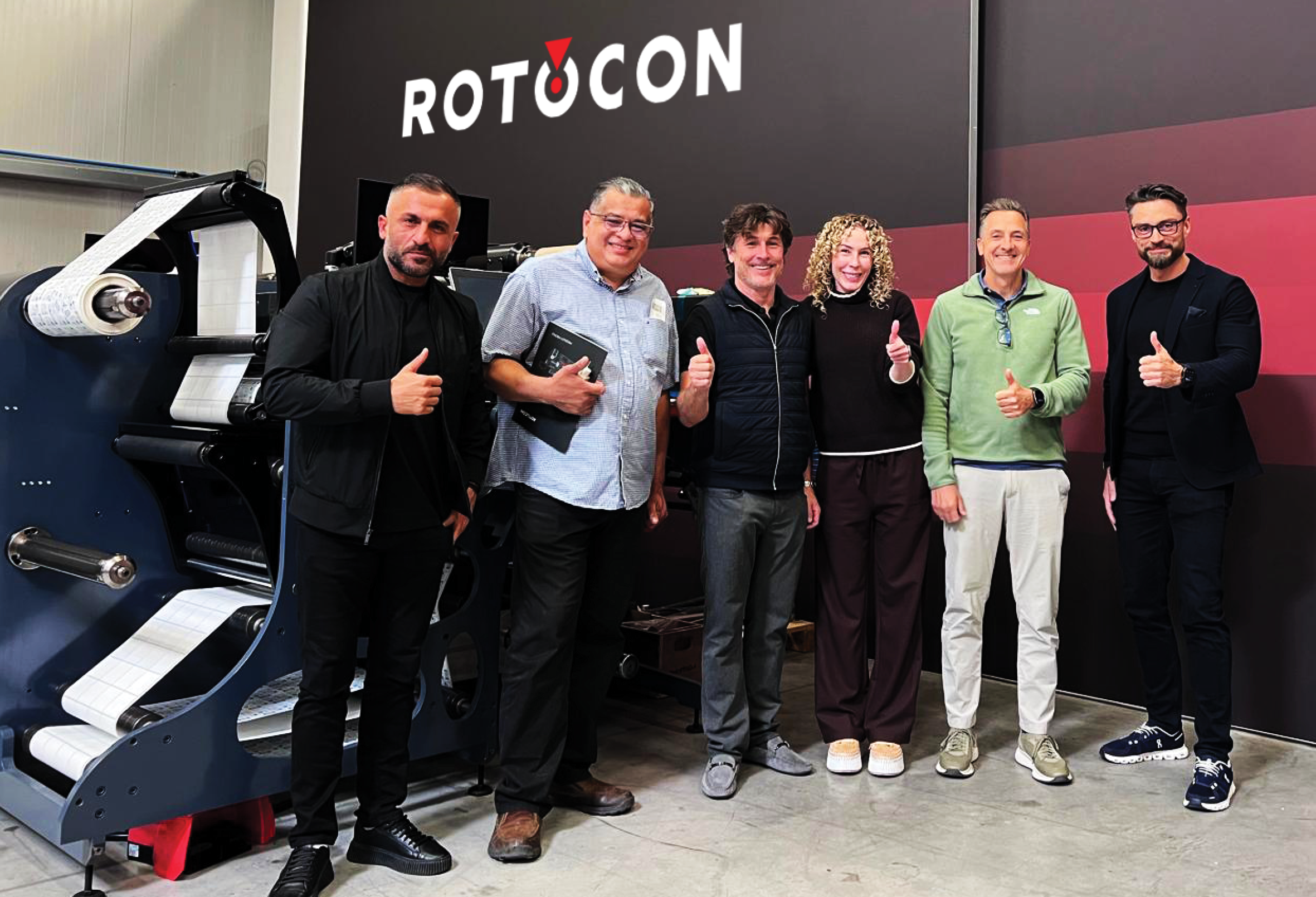
Today, ROTOCON’s footprint spans Africa, Europe, Asia and the USA. Its turnkey model covers consultation, design, installation, training and after-sales service. Whether supplying its own machines or integrating technology from the brands it represents, ROTOCON tailors each solution to the customer’s production goals.
‘The refreshed brand identity is a visual embodiment of this philosophy. It signals confidence in the brand’s trajectory, strength in the technology we build and belief in the partnerships that continue to drive our success,’ ROTOCON adds.
A brand that grows with you
ROTOCON emphasises reliability, technical expertise and cutting-edge machinery, as well as loyalty and long-term relationships. Printers seek partners who understand their challenges and support them as they grow, modernise and compete in global markets.
‘ROTOCON was built on this principle. And as our customers continue to grow, innovate and push boundaries, the company grows with them – offering continuity, trust and partnership long after installation is complete,’ ROTOCON concludes.
Featured in PPM
Subscribe to our mailing list here
9 / 9